Stock price forecasting using time series
The concept behind how stock market work is very simple. The stock market allows buys and sellers to negotiate price and make trades. The demand and supply of stock governs the price for each traded stock. There are many factors that governs the demand and supply of stock. Physical factors vs psychological, Rational and irrational thinking of traders etc. all these factors make the share price volatile. And thus predicating the accurate future price of stock is one of the most difficult problem to solve.
Machine learning has the potential to ease the whole process by analyzing large chuncks of data, spotting significant patterns and generating a single output that naviagtes traders towards a particular decision based on predicated asset price trend.
Stock prices are not randomly generated values instead they can be treated as a discrete-time series model which is based on a set of well-defined numerical data items collected at successive points at regular intervals of time. Since it is essential to identify a model to analyze trends of stock prices with adequate information for decision making, it recommends that transforming the time series using ARIMA is a better algorithmic approach than forecasting directly, as it gives more authentic and reliable results.
Lets get started
# First lets import all the required libraries
# Imports for data processing and visualization
import pandas as pd
import datetime
import pandas_datareader.data as web
import matplotlib.pyplot as plt
import numpy as np

# Imports for time series
from statsmodels.tsa.stattools import adfuller
from statsmodels.tsa.seasonal import seasonal_decompose
from statsmodels.tsa.stattools import acf,pacf
from statsmodels.tsa.arima_model import ARIMA
from statsmodels.graphics.tsaplots import plot_acf,plot_pacf
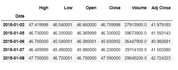
We are going to forecast stock price of microsoft (ticker: ‘MSFT’). We will be using pandas_datareader api to extract historical stock prices from yahoo finance.
start = datetime.datetime(2015, 1, 1)
end = datetime.datetime(2020, 1, 17)
ticker="MSFT"
df = web.DataReader(ticker, 'yahoo', start, end)
df.head()
Lets visualize per day closing prices
fig=plt.plot(df[['Close']])
fig=plt.xlabel('Years')
fig=plt.ylabel('Stock price($)')
fig=plt.title(str(ticker))
plt.savefig('msft_trend.png')
plt.show()
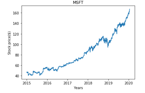
A time series is consist of three systematic components namely level, trend, seasonality, and one non-systematic component called noise.
These components are defined as follows:
- Level: The average value in the series.
- Trend: The increasing or decreasing value in the series.
- Seasonality: The repeating short-term cycle in the series.
- Noise: The random variation in the series. First, we need to check if a series is stationary or not because time series analysis only works with stationary data.
ADF (Augmented Dicky- Fuller)Test: The Dicky-fuller test is one of the most popular statistical test to determine the presence or absence of stationary characteristics in a time series. Following are the hypothesis of this test:
- Null Hypothesis: The series has a unit root (value of a =1).
- Alternative Hypothesis: The series has no unit root. If we fail to reject the null hypothesis, we can say that the series is non-stationary. This means that the series can be linear or difference stationary. If both mean and standard deviation are flat lines (constant mean and constant variance), the series becomes stationary.
result=adfuller(df.Close)
print('ADF Statistic: {}'.format(result[0]))
print('p-value:n{}'.format(result[1]))
print('critical Values:')
for key,value in result[4].items():
        print('\t{}:{}'.format(key,value))
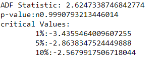
We can see that the p-vale is more than 0.05 and thus we can reject the null hypothesis, meaning our time series is non stationary.
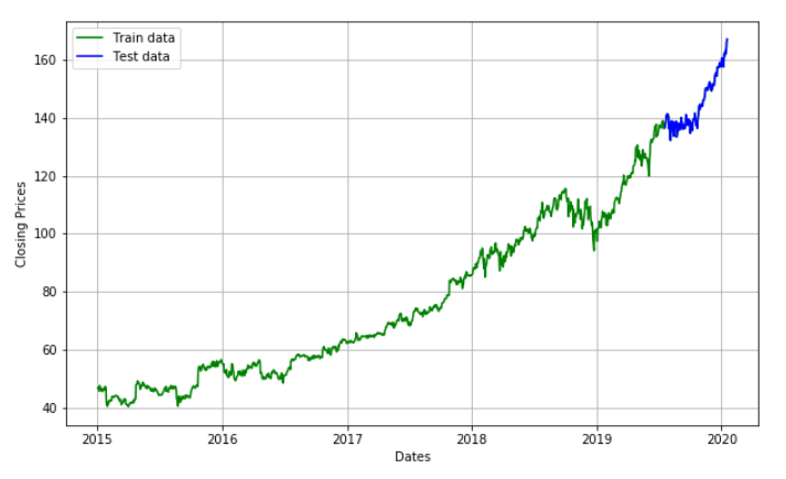
We are going to create an ARIMA model and will train it with the closing price of the stock on the test data. So let us split the data into training and test set and visualize it.
#train- test set
train_size=int(len(df)*0.90)
train,test=df.Close[0:train_size],df.Close[train_size:]

df.Close[int(len(df)*0.90):]
plt.figure(figsize=(10,6))
plt.grid(True)
plt.xlabel('Dates')
plt.ylabel('Closing Prices')
plt.plot(df.Close, 'green', label='Train data')
plt.plot(test, 'blue', label='Test data')
plt.legend()
Before we go on to build our forecasting model, we need to determine optimal parameters for our model. For those optimal parameters, we need ACF and PACF plots. A nonseasonal ARIMA model is classified as an “ARIMA(p,d,q)” model, where:
- p → Number of autoregressive terms,
- d → Number of nonseasonal differences needed for stationarity, and
-
q → Number of lagged forecast errors in the prediction equation. Values of p and q come from ACF and PACF plots. So let us understand both ACF and PACF!
-
Autocorrelation Function(ACF):Statistical correlation summarizes the strength of the relationship between two variables. Pearson’s correlation coefficient is a number between -1 and 1 that describes a negative or positive correlation respectively. A value of zero indicates no correlation.
- Partial Autocorrelation Function(PACF):A partial autocorrelation is a summary of the relationship between an observation in a time series with observations at prior time steps with the relationships of intervening observations removed.
df_close_log=np.log(df.Close)
df_close_log_diff = df_close_log - df_close_log.shift()
df_close_log_diff=df_close_log_diff.dropna()

# we use d value here(data_log_shift)

acf = acf(df_close_log_diff, nlags=15)
pacf= pacf(df_close_log_diff, nlags=15,method='ols')
#plot PACF
plt.subplot(121)
plt.plot(acf)
plt.axhline(y=0,linestyle='-',color='blue')
plt.axhline(y=-1.96/np.sqrt(len(df_close_log_diff)),linestyle='--',color='black')
plt.axhline(y=1.96/np.sqrt(len(df_close_log_diff)),linestyle='--',color='black')
plt.title('Auto corellation function')
plt.tight_layout()
#plot ACF
plt.subplot(122)
plt.plot(pacf)
plt.axhline(y=0,linestyle='-',color='blue')
plt.axhline(y=-1.96/np.sqrt(len(df_close_log_diff)),linestyle='--',color='black')
plt.axhline(y=1.96/np.sqrt(len(df_close_log_diff)),linestyle='--',color='black')
plt.title('Partially auto corellation function')
plt.tight_layout()
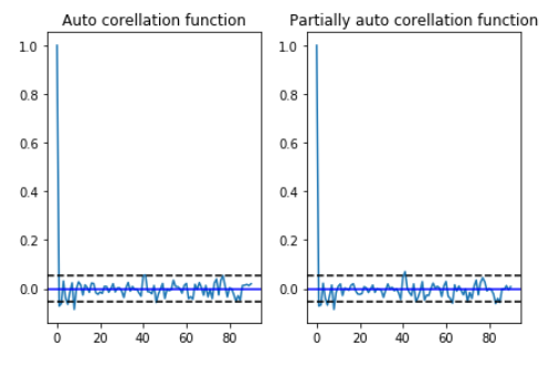
In order to find the p and q values from the above graphs, we need to check, how many lags cross the line of threshold in the graph. From the above graph the p and q values are merely close to 3 where the graph cutts off the origin.
Model fitting
Similar to the calculation of ACF and PACF we need to take log of train and test data to fit the ARIMA model.
#train- test set (Log scale)
train_size=int(len(df_close_log)*0.90)
train,test=df_close_log[0:train_size],df_close_log[train_size:]
Now we have all that we want, lets go ahead and fit our model
model = ARIMA(train, order=(3,1,3))
result_AR = model.fit(disp = -1)
print(result_AR.summary())
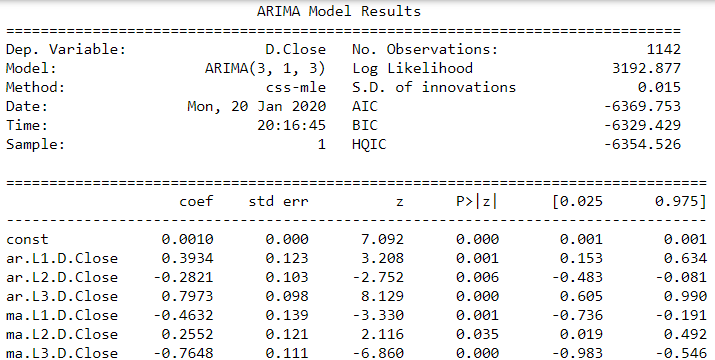
Now the fun part, lets predict the future trend of data.
# Forecast
fc, se, conf = result_AR.forecast(127, alpha=0.05)  # 95% confidence
fc_series = pd.Series(fc, index=test.index)
lower_series = pd.Series(conf[:, 0], index=test.index)
upper_series = pd.Series(conf[:, 1], index=test.index)
plt.figure(figsize=(15,8), dpi=100)
plt.plot(train, label='training')
plt.plot(test, color = 'blue', label='Actual Stock Price')
plt.plot(fc_series, color = 'orange',label='Predicted Stock Price')
plt.fill_between(lower_series.index, lower_series, upper_series,
                 color='k', alpha=.10)
plt.title('Altaba Inc. Stock Price Prediction')
plt.xlabel('Time')
plt.ylabel('Actual Stock Price')
plt.legend(loc='upper left', fontsize=8)
plt.show()
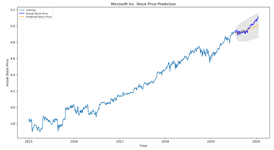
As you can see our model did quite handsomely. Let us also check the commonly used accuracy metrics to judge forecast results:
# report performance
mse = mean_squared_error(test, fc)
print('MSE: '+str(mse))
mae = mean_absolute_error(test, fc)
print('MAE: '+str(mae))
rmse = np.sqrt(mean_squared_error(test, fc))
print('RMSE: '+str(rmse))
mape = np.mean(np.abs(fc - test)/np.abs(test))
print('MAPE: '+str(mape))

Around 5.4% MAPE(Mean Absolute Percentage Error) implies the model is about 94.6% accurate in predicting the test set observations.





Leave a comment