Stock price analysis using pandas and matplotlib.
The most important formula to achieve financial freedom is to become a investor not a customer. There are many ways you can invest your money. Stock market is one of many possible ways to invest your hard-earned money. The reason that savvy investors invest in stocks is that they provide the highest potential returns and over the long term, no other type of investment tends to perform as good as stock market.
There are thounds of stocks listed on US stock exchange, however not all stocks perform equily great. Thus, it is a good idead to do some prior analysis before buying any stock. In this blog I will cover few of techniques you can utilize using python pandas for analyzing historical stock prices and historical stock performance comparing with competitors.
Before starting our analysis you need to extract historical stock price data. You can find this data online on number of site. The easist way to load data is using pandas_datareader api. using this library you can load most updated financial data from sources like Yahoo Finance, Google Finance, Enigma etc.
Lets import all the necessary libraries
#For data processing
import pandas as pd
import numpy as np
import datetime
import pandas_datareader.data as web
#For data visulization
import matplotlib.pyplot as plt
import seaborn as sns
Now that we have all the required libraries, lets go ahead and extract Microsoft stock prices for last 10 years.
start = datetime.datetime(2010, 1, 1)
end = datetime.datetime(2020, 1, 14)
ticker="MSFT"
df = web.DataReader(ticker, 'yahoo', start, end)
df.tail()
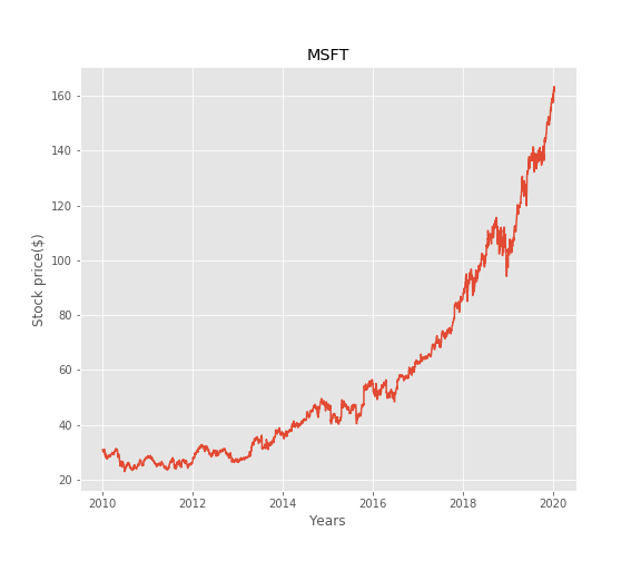
Let’s plot the data for better understanding.
fig=plt.plot(df[['Close']])
fig=plt.xlabel('Years')
fig=plt.ylabel('Stock price($)')
fig=plt.title(str(ticker))
plt.show()
Rolling Mean (Moving Average) - Cut down noise.
Rolling mean/Moving Average (MA) smooths out price data by creating a constantly updated average price. This is useful to cut down “noise” in our price chart. Furthermore, a rising moving average indicates that the stock is in an uptrend, while a declining moving average indicates that it is in a downtrend. We can use ‘rolling’ method of pandas to calculate moving average over a specific window.
# Moving average over 100 days window.
close_price= df['Adj Close']
mv_avg=close_price.rolling(window=100).mean()

# Lets plot moving average
fig=close_price.plot(label=ticker)
fig=mv_avg.plot(label='mavg', linewidth =4)
fig=plt.xlabel('Years')
fig=plt.ylabel('Stock price($)')
fig=plt.title(str(ticker))
plt.savefig('msft_rolling_avg.png')
plt.show()
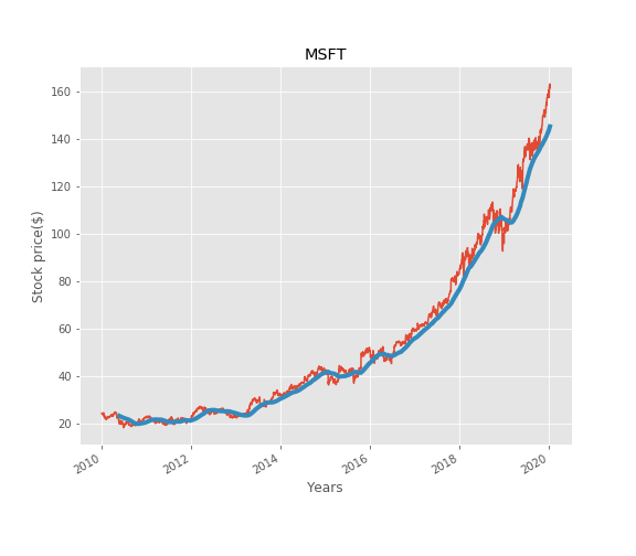
The Moving Average makes the line smooth and showcase the increasing or decreasing trend of stocks price. In this chart, the Moving Average showcases increasing trend the upturn or downturn of stocks price. Logically, you should buy when the stocks are experiencing downturn and sell when the stocks are experiencing upturn.
Stock Price Volatility
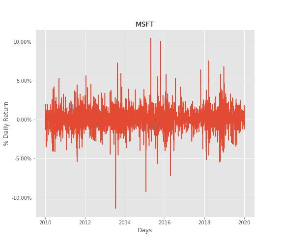
Another important factor to consider while deciding long term investment is the price flactuation risk. The ideal investment should have minimum possible price flactuation and upward price trend,however in really life all stocks are subject to price flactuaton risk. We can calculate this from daily returns.
Following is the formula you could refer to:
Based on the formula, we could plot our returns as following.
rets=close_price/close_price.shift(1)-1
fig= sns.lineplot(data=rets, markers= True)
fig.set(xlabel='Days', ylabel='% Daily Return', title=ticker)
#changing ylables ticks
y_value=['{:,.2f}'.format(x*100) + '%' for x in fig.get_yticks()]
fig.set_yticklabels(y_value)
plt.savefig('msft_price_variation.png')
plt.show()
# Another great way of seeing varibility is the  frquency distribution plots
rets=rets.dropna()
fig= sns.distplot(rets)
plt.savefig('msft_hist.png')
plt.show()
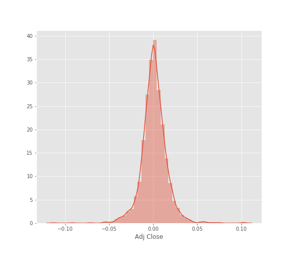
Daily returns are normally distributed, notice that bell curve has a norrow width. Meaning there was not much of price flactuation in microsoft share price over last 10 years.
Analysing Competitor .
Question: How to find competitors? While finding competitors of any company often its good idea to define the industry and the segment 1st. following are the some resouces to find competitors.
If a US public company, look at its 10-K (annual report). Firms generally discuss their competitors. You can locate the 10-K on a company’s investor site, through sales intelligence vendors, or free Edgar sites. If a private company, look at Owler, a free site (See below). This is crowdsourced so may include firms that aren’t true competitors. Many industries have industry specific market research that includes competitors. A few general market research firms also provide competitors (e.g. MarketLine, Euromonitor, Global Data, and Freedonia). Top Competitors are also available in IBISWorld, Vertical IQ, and First Research.
I am going to consider Microsoft’s top competitors in cloud technologyy industry namely Amzon, Google, IBM, Oracle. _Note: These are the top cloud infrastructure compnies by market share.
# Now lets go ahead and load data from yahoo finance.
dfcomp = web.DataReader(['MSFT','AMZN','GOOG','IBM','ORCL' ],
                        'yahoo',start=start,end=end)['Adj Close']
 # lets find out the general trend for all the stocks.
dfcomp.plot()
plt.show()
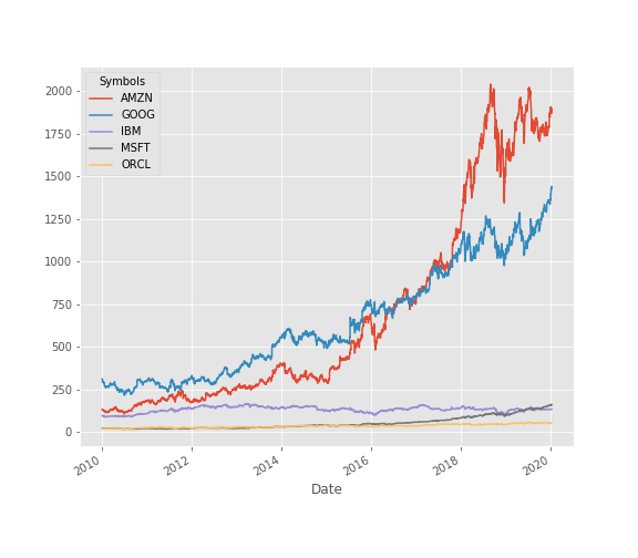
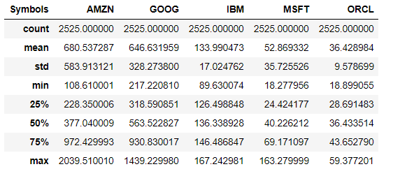
Well you can clearly see the winner here. However all the stocks had different initial price points, basing our judgement just on above graph might not be a good idea.
dfcomp.describe()
Risk vs Returns
Risk vs return matrix provides better understanding of investments with different price points. You can calculate the risk of investment by calculating its price volatility i.e. stadandard deviation. For returns we will consider the average daily return.
plt.scatter(retscomp.mean(), retscomp.std())
plt.xlabel('Expected returns')
plt.ylabel('Risk')
plt.axis([0,0.002 , 0.01, 0.020])
for label, x, y in zip(retscomp.columns, retscomp.mean(), retscomp.std()):
    plt.annotate(
        label,
        xy = (x, y), xytext = (20, -20),
        textcoords = 'offset points', ha = 'right', va = 'bottom',
        bbox = dict(boxstyle = 'round,pad=0.5', fc = 'yellow', alpha = 0.5),
        arrowprops = dict(arrowstyle = '->', connectionstyle = 'arc3,rad=0'))
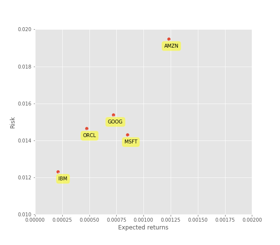
Now you could view this neat chart of risk and return comparisons for competing stocks. Though amzon had a maximum return it also had the maximum risk. Logically, you would like to minimize the risk and maximize returns. Now, you might wonder how can you compare stocks with different risk return profile apple to apple. In such cases you should consider calculating sharpe ratio which tells you the average return per unit risk taken. You check my blog on sharpe ratio to know more about it.
Correlation Analysis — Does change in price of one competitor affects other?
We can analyse the competition by running the percentage change and correlation function in pandas. Percentage change will find how much the price changes compared to the previous day which defines returns. Knowing the correlation will help us see whether the returns are affected by other stocks’ returns.
retscomp = dfcomp.pct_change()
corr = retscomp.corr()
Let’s plot a scatter matix to see the possible correlation among competing stocks. At the diagonal point, we will run Kernal Density Estimate(KDE).
fig=sns.pairplot(retscomp, kind='reg',diag_kind='kde')
plt.show()
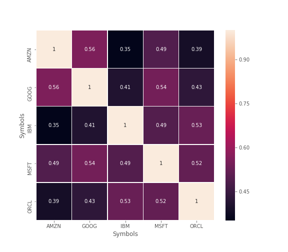
From here we could see most of the distributions among stocks is approximately positive correlated. However its not that clear from above figure that how much they are correlated. We can better visualize that using heatmap.
Notice that the maximum correlation we have is 56%. From the Scatter Matrix and Heatmap, we can find great correlations among the competing stocks.Also this helps to find the overall indutry trend.
In the next blog I will show you how to use machine learning for forecasting future price trends.
Luckily, now a days there are some great online platforms where you can see live stats and great viualizations for helping investment decisions.
Following are 2 of my faviore apps which are currently offering free stocks for joining.
Try Out above apps you might find some more ideas to implement in your analysis.
Happy coding:) Happy Investing :)
Disclaimer: This disclaimer informs readers that the views, thoughts, and opinions expressed in the text belong solely to the author and should not consider as any investment advice. This blog soley written for the education purpose.



Leave a comment